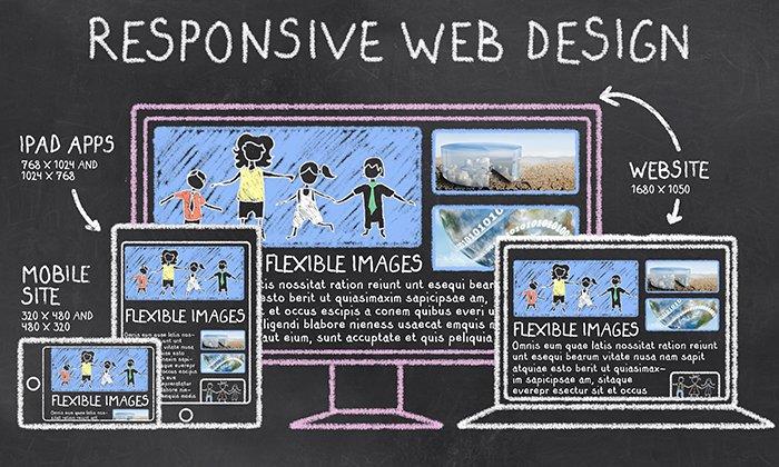
Understanding the Principles of Responsive Web Design
Responsive Web Design (RWD) is an essential approach to web development that aims to create websites that provide an optimal viewing experience across a wide range of devices. This means that irrespective of whether a user is browsing on a smartphone, tablet, or desktop computer, the website will automatically adjust its layout, images, and functionalities to fit the screen size. Implementing RWD involves fluid grids, flexible images, and CSS media queries, which collectively ensure that content appears appropriately on various devices. By adopting these principles, you not only enhance user experience but also improve your site's SEO performance, as search engines favor mobile-friendly sites.
Key elements of Responsive Web Design include:
- Fluid Grids: Utilizing relative units like percentages instead of fixed units like pixels allows the layout to adapt seamlessly to any screen size.
- Flexible Images: Images should be responsive and resize according to the visitor's screen to prevent distortion and improve load times.
- Media Queries: CSS techniques that apply different styles to different screen sizes help optimize the website's appearance.
Common Mistakes in Responsive Design and How to Avoid Them
Responsive design is essential for delivering a seamless user experience across various devices, but many designers still fall into common pitfalls. One significant mistake is not testing the design on different screen sizes and platforms. Smashing Magazine emphasizes the importance of using a variety of devices for testing. This ensures that your site looks great and functions properly on everything from smartphones to large desktop monitors. Failing to conduct comprehensive testing can lead to layout issues that frustrate users and increase bounce rates.
Another frequent issue is the misuse of media queries. Many developers mistakenly limit functionality by using fixed breakpoints rather than fluid design principles. Instead of designing for specific devices, consider creating flexible layouts that adapt to any screen size. According to CSS-Tricks, leveraging relative units like percentages and ems alongside flexible images can enhance the responsiveness of your design. Avoid hardcoding widths and heights, which can lead to both usability and accessibility problems across varying browsers and devices.
How to Test Your Website's Responsiveness Across Devices
In today's digital landscape, ensuring that your website is responsive across devices is crucial for providing an optimal user experience. A responsive website adjusts to various screen sizes, whether it's a mobile phone, tablet, or desktop. To test your website's responsiveness, start by using tools such as Google's Mobile-Friendly Test. This tool analyzes your site and indicates how well it performs on mobile devices. Additionally, utilize browser developer tools (accessible by right-clicking on a webpage and selecting 'Inspect') to view your site in different screen resolutions.
Furthermore, manual testing can be beneficial. Open your website on multiple devices or use LambdaTest's Responsive Tester to emulate various devices. Pay attention to key aspects such as navigation, text readability, and image scaling. A well-optimized site should offer seamless access and functionality regardless of how it's viewed. Always remember to regularly re-evaluate your site’s responsiveness, especially after making significant updates or changes.